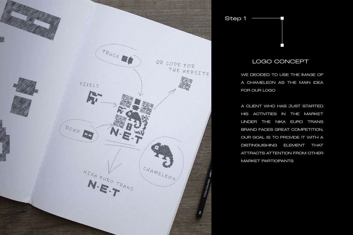

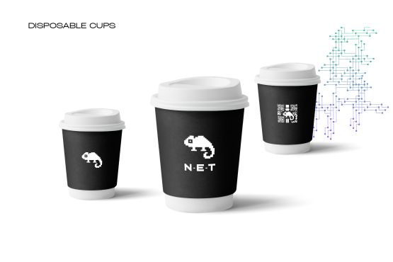
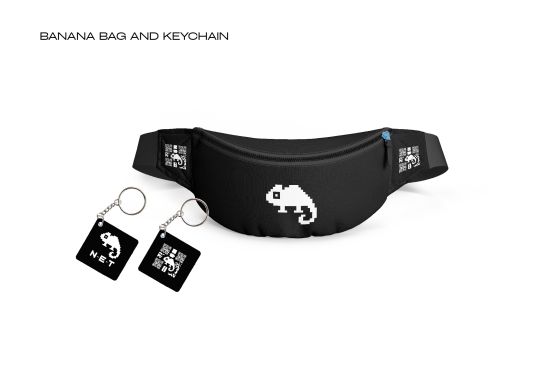
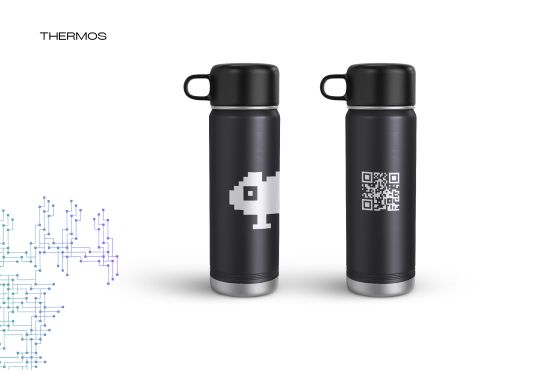
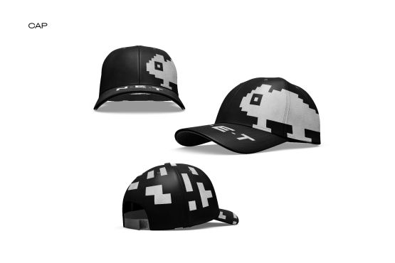
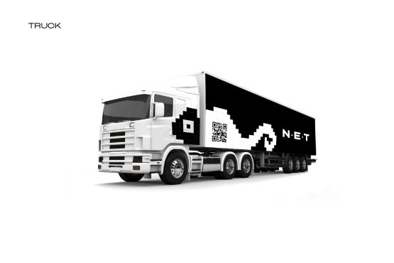
Taking into account the conservatism of the EU logistics market, we decided to "take" the market with a creative visual concept. Driven by brain neural connections (our thinking process), which are similar to logistics paths, we created a mascot - Chameleon, that highlight our 360 thinking that strengthens our brand positioning - thinking logistics
THE CLIENT
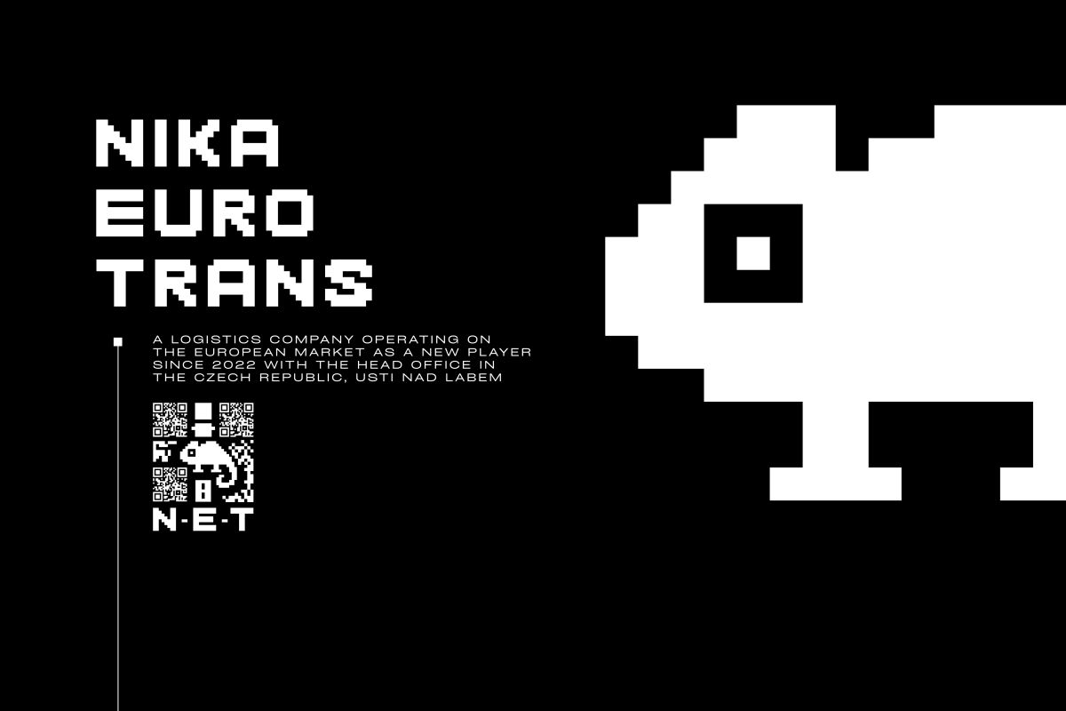
N-E-T (NIKA EURO TRANS) a logistics company operating on the European market as a new player since 2022 with the head office in the Czech Republic, Usti nad Labem
THE TASK
To build a strong recognizable brand image of N-E-T logistics company in the EU market that differentiates and motivate to join the team with a strong HR brand
THE SOLUTION
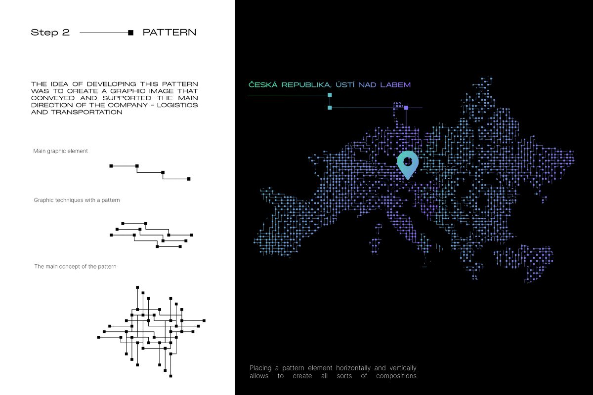
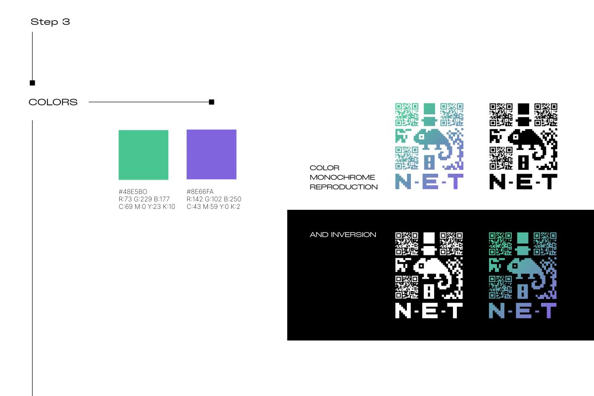
When developing the branding for NIKA EURO TRANS, our team placed special emphasis on incorporating the company's desire to stand out in the logistics market and highlight its innovation and thinking. We set out to emphasize the extensive experience and high service standards by incorporating symbols of efficiency, thoughtfulness, and high-quality logistics into the brand. Our approach was based on creating recognizable elements that distinguish NIKA EURO TRANS as a modern, innovative, and successful company in the logistics market.
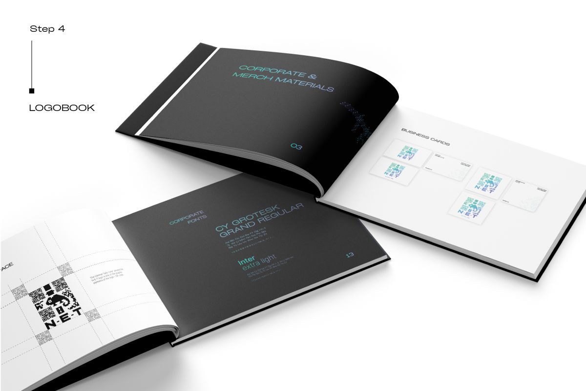
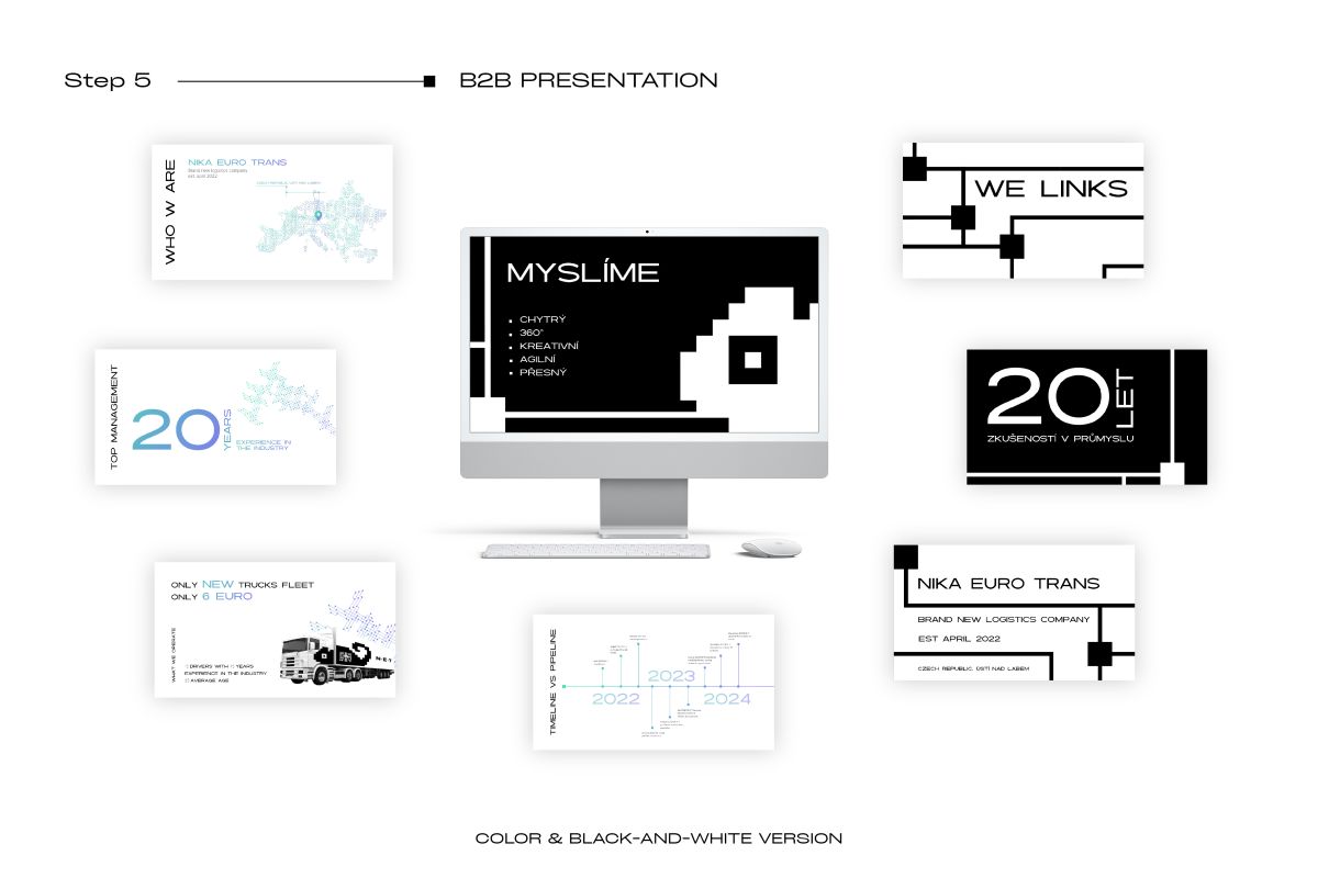
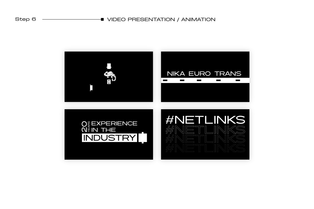
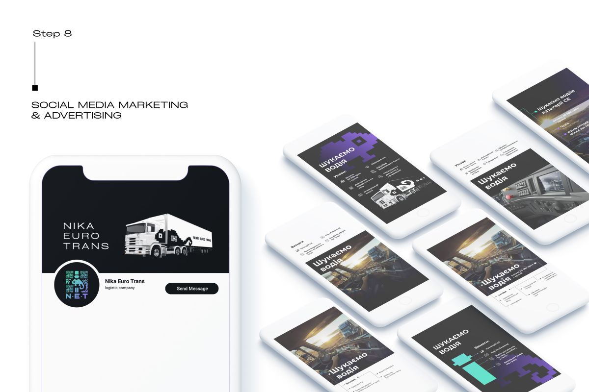
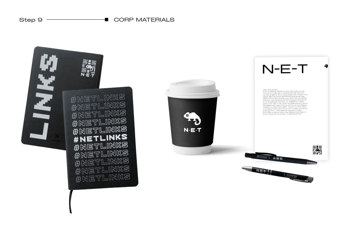
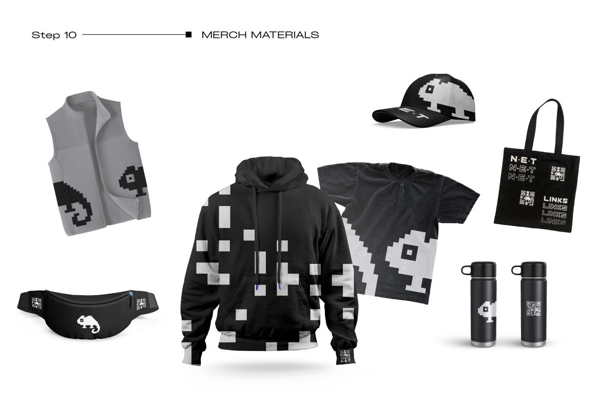
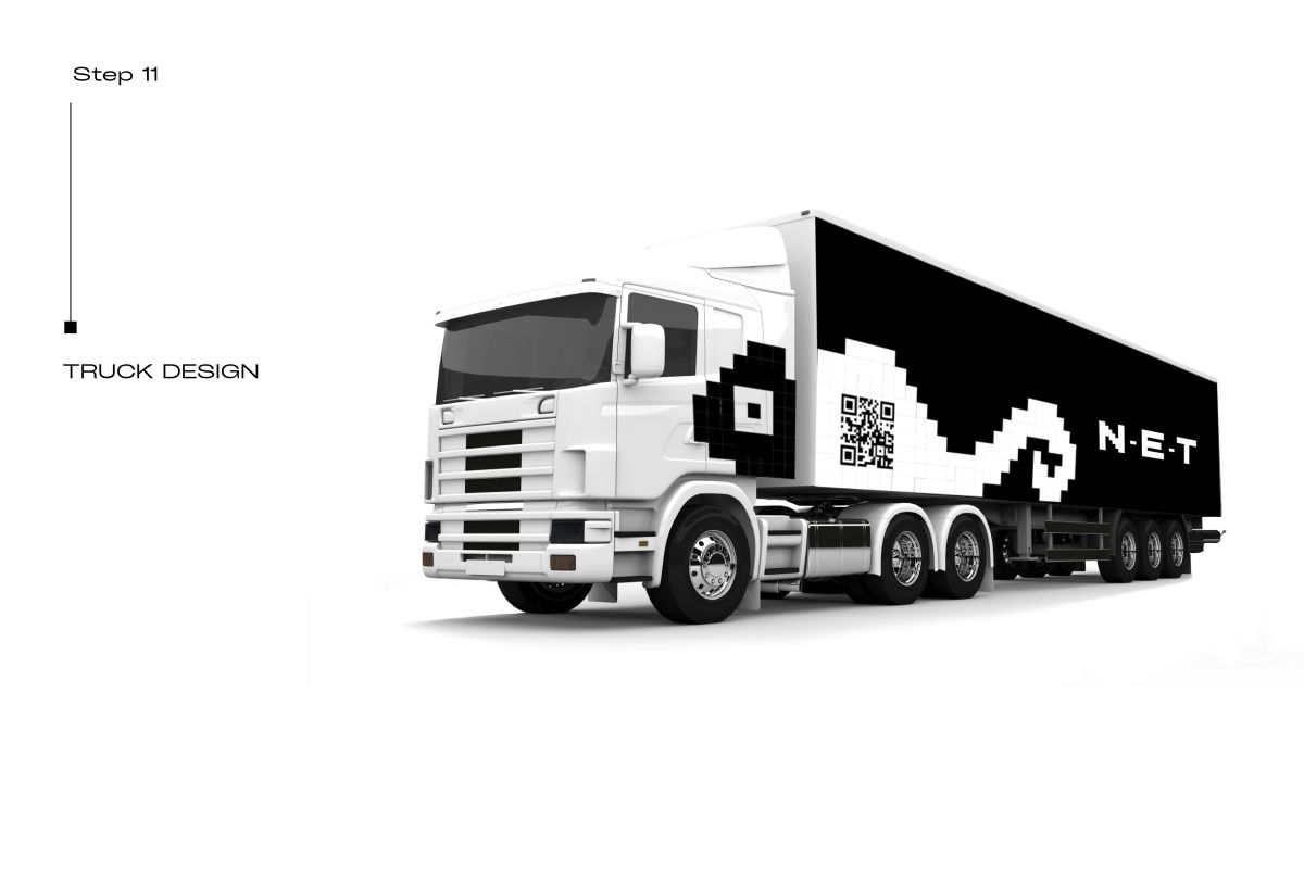
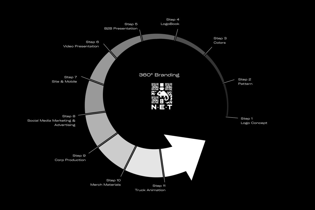
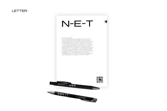
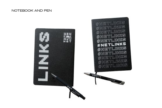
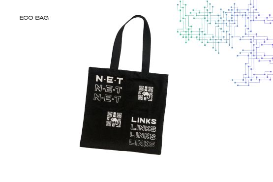
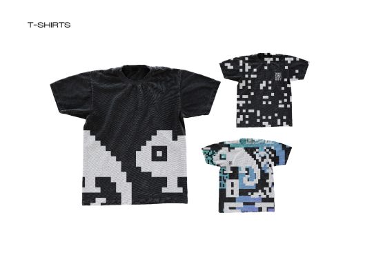
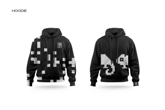
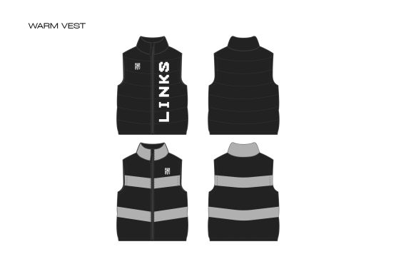
As a result, we created 360 branding that include: Logo Concept, Pattern, Colors, Logobook, B2B presentation, Video Presentation, Advertising, Corp Materials, Merch Materials, Truck Design
SLOGAN #NETlinks
The Corporate WEBSITE https://n-e-t.cz/en/ ![]()
An ongoing project. To be continued 2024..